3

East Herts Gold Club approached GDA in Autumn 2020 to redesign their logo, saying it was out-of-date and poorly executed.
The existing logo included an illustration of a stag representing Hertfordshire. It had been with the club for as long as anyone could remember. However, the first round of the design process would include the Hamels Park gatehouse, a unique feature of the golf club and its identity.
The gatehouse illustration had positive feedback from the club committee. However, when it went before the members, it stalled. It was evident that the stag was an emotive issue and was here the stay.
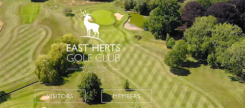
The agency then offered up a selection of stag in different postures that the club could choose. The choice was a stag standing, looking east, whereas it had previously been lying down. Our illustrators proceeded with the final version of the stag on a crescent that, when developed with the timeless Gill Sans typeface and rich Pantone 3035c blue/green into assets, can be used large and small in print and digital.
The final logo looks great, was well-received, and has been rolled out across the clubs’ new website and printed matter this summer.