2

Our brand started out in 1985 with a yellow identity which was perfect for the time. By the mid-90s we moved to a blue palette that saw us through to the last major change in 2009 and Pantone Red 032. This worked across print, advertising, signage, website and the spread of social media platforms.
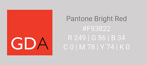
2019 was time for change. We decided to stay with a red and went with the more vibrant Pantone Bright Red. It’s orangy, sharper and more engaging and works better with digital output.
We’ve pretty much dropped our full name. The GDA lettermark in a flat red square is now our primary logo working well at all sizes. Gill Sans remains but is dropped from headings or body copy and replaced with Roboto, a neo-grotesque sans-serif Google Font designed by Christian Robertson.
A brand is an evolving marker of an organisation and how it functions. Staying fresh is important for any identity. Change does not necessarily mean a complete redesign, however, fine adjustments often stop a brand from becoming tired and left behind.